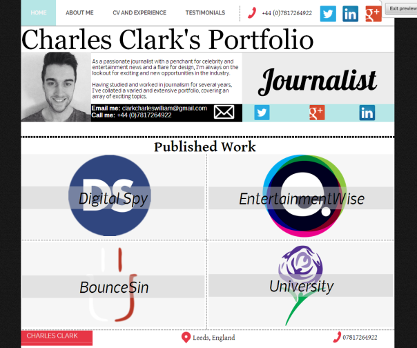
As mentioned in a previous blog post, I had sorted my work by publication, as can be seen in the image below, with each logo on the homepage linking to a catalogue of articles from that particular publication.
However, over the course of the module, I’ve been reconsidering how I’m going to sort my work. Luckily, because I started work on my Moonfruit portfolio almost immediately when we started the module, I’ve had time to assess the advantages and disadvantages of various designs.
On my portfolio, I want to showcase only my best work, and I found that over the past few years my writing skills have developed and improved a lot. This means that the work I did earlier on in the course or on earlier work placements isn’t as good as more recent work.
Personally, I would rather not have the weaker material on the portfolio, and therefore, if I do it by publication, I would have a section that showcased weaker writing from an earlier placement than the section with, say, my work at Digital Spy which is more recent.
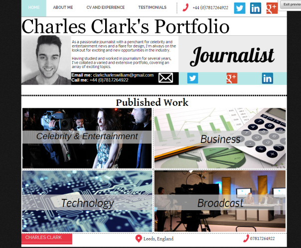
Therefore, I think that dividing my work by genre (Eg. Entertainment, technology, etc…) would be more beneficial. This means I can pick and choose my best work but still have sufficient content in each area.
Below is a screenshot of the revisions I’ve made to the home page:
As you can see, I obviously had to change the images. I had previously got permission from the respective companies to use their logos in the previous design. However, I can still use them around the website even if they’re not on the home page which is useful.
All the images I’ve used in the new design are also creative commons. However, the picture I’ve used in the ‘broadcast’ square is only a temporary picture as I intend to take a picture in the Leeds Met news studio next time I am in there and use it on the website.
The only thing that would tempt me to stick with the original logo approach is the look of it – It looks cleaner and crisper. However, functionality and ease of navigation are more important in my opinion, and the new design doesn’t exactly look bad!


