One error that I’ve noticed when looking back over my portfolio is the inconsistency in colour scheme.
Although the difference in colours is not dramatic, it is just noticeable. For example, the blue on one page is lighter than the blue on another page, which takes away from the professional look.
I’ve also made all heading font is the same font – Georgia.
Because I keep getting distracted by one page, I think I sometimes forget to keep the consistency going throughout, which is something I need to keep my eye on.
Another aspect of the portfolio I’m wanting to improve on is the white space. Some pages have ended up looking rather clustered so I’ve tried to find a way around this.
To start with, I took away some of the articles I had links to so there wasn’t massive lists of text taking up so much room. It doesn’t matter that I have less articles on my actual portfolio, as on each of the websites I’ve linked to, you can click my byline and see a full archive of the articles I’ve written for that website.
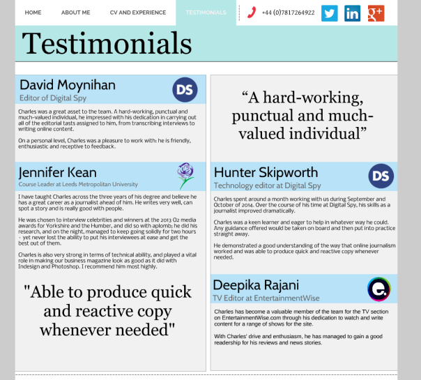
Also, on several pages, I’ve got rid of the grey background and replaced it with a white one. This makes the page look easier on the eye due to the white space, as can be seen in the screenshots below.
You can also see in the screenshots that I’ve changed the colour of the testimonial header backgrounds accordingly, so it is now the same colour as the masthead, with slightly more transparency.
For comparison, I’ve inserted a screenshot I took a couple of months ago of my testimonials page when I first created it. From this picture, you can see I’ve made a lot of changes. It’s a lot cleaner looking than it previously was, when the colours were very in-your-face.


